We've Figured Out The Top 8 Lottery Website Designs And Some Of Them Are Disasters
/
A couple of times a day we change the jackpot figures on our 'Playing This Week' lottery sites. That's it over on the right.
To get the updates we look at these lottery sites a lot - far more than any player would. But the big surprise is how poorly these sites are designed. After all, there's big money involved right? Millions of dollars pass through these organisations every week.
 But it looks though many of them don't spend even a fraction of that on website design.
There's only a few in the lineup that we think are attractive and appealing... sites that would make a player feel good when they view the pages.
Of course this all doesn't matter when all you want to do is win the jackpot. Looks don't count there.
But a good design always makes the site attractive to return to.
So here's our opinion of the best and worst from the sites we show in the results column, and some brief comments.
We looked for 3 main qualities on the home pages:
1. Brightness. This means the way the site attracts us with 'lottery' colors and some zing in the design.
2. Navigation. How easy it is to get where you want to go.
3. Mechanics. How fast the site loads and whether it has parts that work well or not.
It was interesting to note that a few of these sites have the same style - a slideshow section at the top, player sections underneath. Only Powerball and Mega Millions moved away from that standardised layout.
The Top 8 Lottery Website Designs
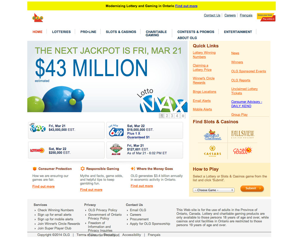
Eighth: Canada Lotto Max: This is the homepage for OLG, but it could be done better. Plain layout, uninspiring with plain text links. Chrome browser messes up the text at the bottom. Their results pages are a different design and much better looking in our opinion.
Seventh: Lotto Texas: Changed their site design recently and it looks better, but disjointed sections at the top spoil it for us.

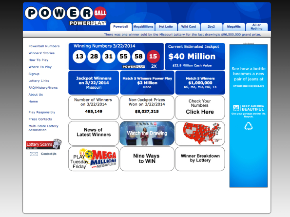
Sixth: USA Powerball: Old-style tickertape shows its age on this site, no logical order to the boxes, plain-jane layout, grey background, no excitement for one of the biggest jackpot sites in the world.
Fifth: UK National Lottery: Restrained design, needs more excitement, standard layout. Throw out the "Mr. C has just won £10.00!" result at the top - only big winners should be there. Some of the text is messed up in Chrome browser. This site only gets to 5th spot because we liked the E-Type Jaguar in the photo.

Fourth: New York Lotto: Appealing colors, logical layout, prominent jackpot numbers. Chrome browser messes with several sections and the overall look is heavy, but not bad.

Third: Canada Lotto 649: This site seems to be undergoing a design mixup, as the home page is a different design to these 649 (and Max) results pages. However since we like the results page look they get 3rd place, and the home page stays in 8th place.

Second: California SuperLotto Plus: Cheerful design, well laid out with a winner photo to give player incentive. Blue and yellow are recognised lottery-style colors.

Top: USA Mega Millions: Bright, good contrast with generous use of black, bold numbers, good lottery colors - especially the rich blue background, easy navigation, photos of winners on home page. A easy-read striking design that others should look to copy.