Bang On Time: Every 6 Years Mega Millions Update Their Website, And We Like It
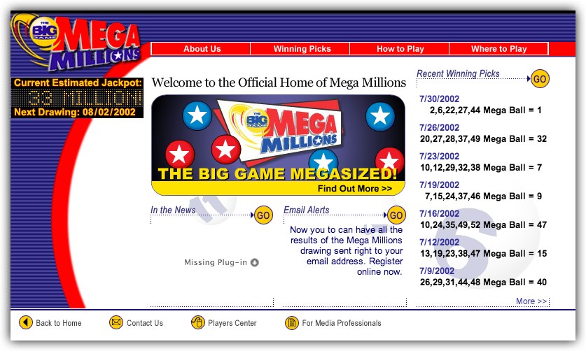
/ The original Mega Millions website in 2002.
THE Mega Millions people are pretty conservative. We know this because they rarely make big changes to their website, and when they do, the redesigns tend to be six years apart.
So a couple of weeks ago, on time, they introduced the first major upgrade since 2008, and we like it.
2002 was the first year the WayBack Machine showed the Mega Millions site. And we guess it looked like the site above when they first started in 1996. Like many sites of that age, it was a little cluttered and showing its age after a while.
After thinking about it for 6 years, they made some more changes, and this is the result.
 This is the change Mega Millions made to their site in 2008.
It has kept its looks quite well until the most recent update a few weeks ago.
The recent change is in line with some big changes they made back in October 2013. They announced bigger jackpots, second tier prizes up to $5 Million with the Megaplier feature, and - they claim - better overall odds.
We disagree with the odds and think they are a step backwards, but that doesn't stop it being the biggest jackpot lottery in the USA.
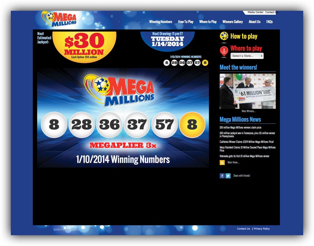
 The new 2014 Mega Millions website. We like the big current results display, next jackpot, and next draw feature.


